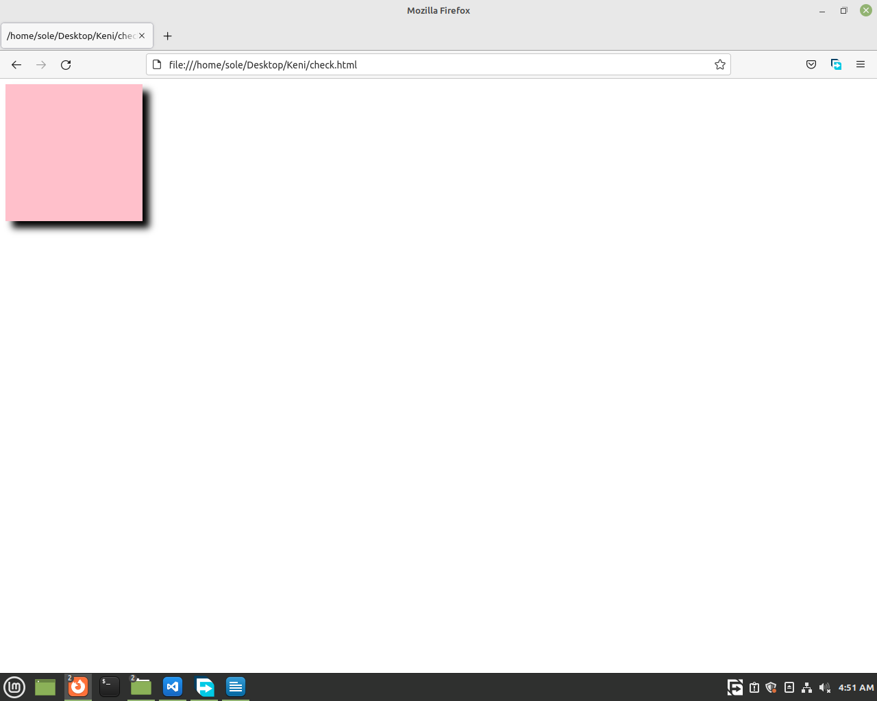
Now, we are going to learn how to add shadow to our elements. We are going to use a div for now.
1, Write the basic HTML code and also add the style tag.
2, Create a div and give it a class of
'my-shadow'.
3, Then in the CSS part select the element by its class, then add the box-shadow property like these.
.my-shadow {
box-shadow: 10px 10px 10px black;
}
The first one indicates how much the shadow moves to the
x-axis(left or right). The second one tells us how much the shadow moves to the
y-axis(top or bottom). The third one is called
blur. It tells as how much the shadow is going to be blurred. Its better for you to check it out to understand more. The four one, you might have guessed it, it's the
color of the shadow. But before running the code let's have a
width and a
height of some amount. We will use 200px for now. And add some
background-color if you want.
.my-shadow {
background-color: pink;
width:
200px;
height: 200px;
box-shadow:
10px 10px 10px black;
}

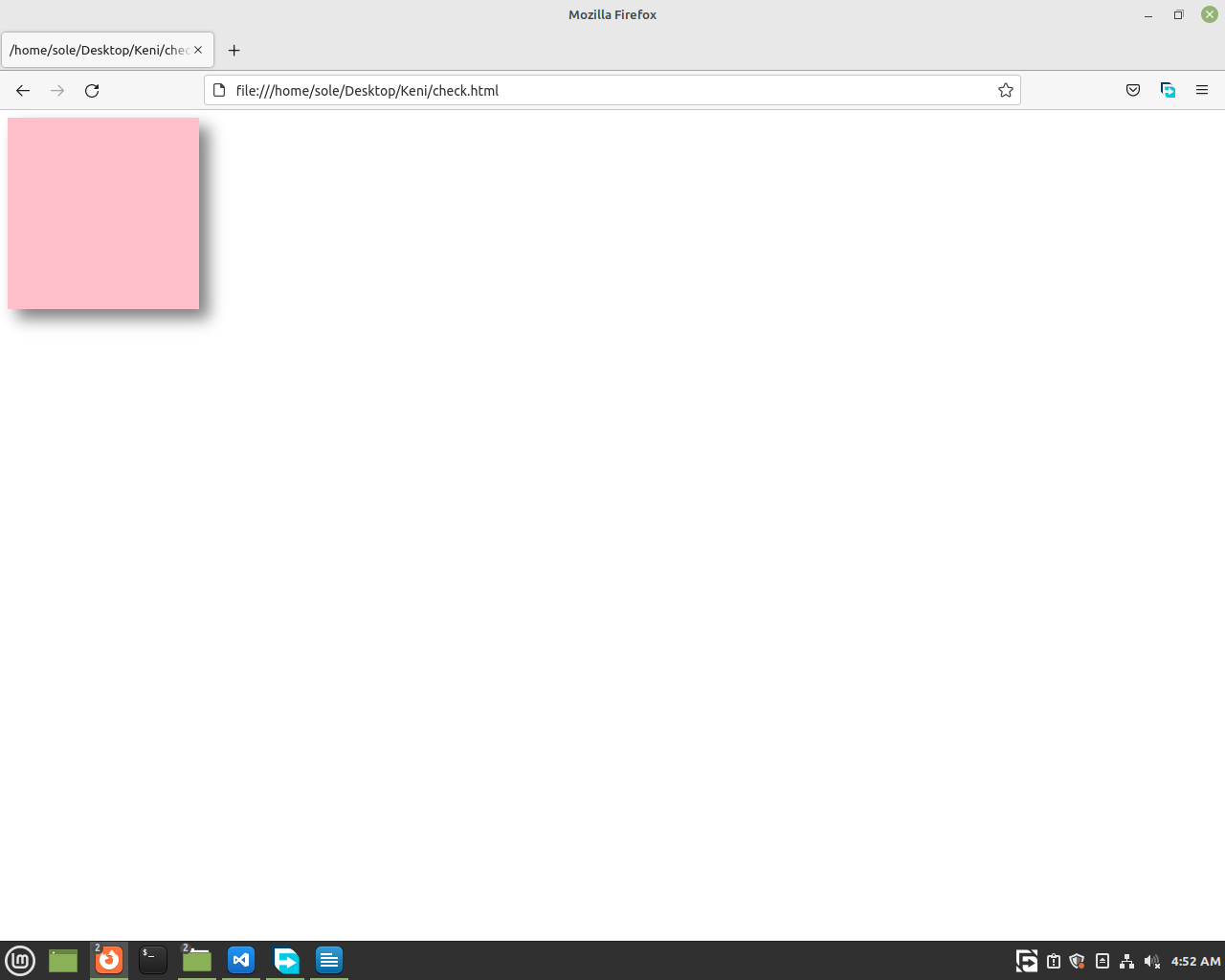
I think 10px of
blur is too bold let's make it 15px and change the
color to grey and add some adjustments. Just do it as you like. It will be better.


