If you want to do some animation on your website you can use CSS. Let's start doing some.
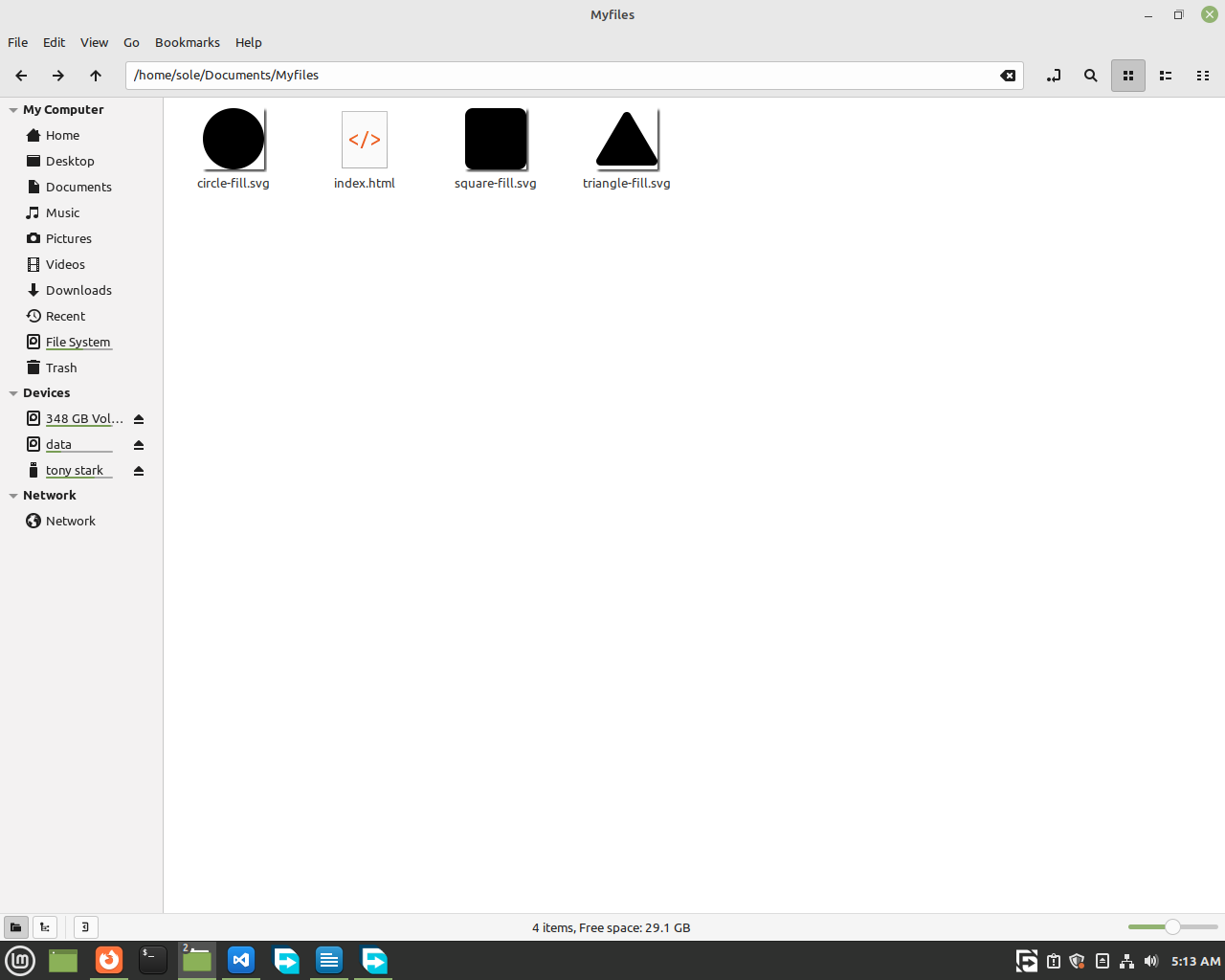
First let's get some images of shapes from the internet. And let's use an image type called
svg. We use svg in our website because it won't get blurry when you zoom in or out. It's really good! You can get free svg images from bootstrap.
For now, go to https://icons.getbootstrap.com and search for your icon click on it, then click on download svg. After you download the image, we will show you an easy way to insert your images into your HTML. Follow up!
Now, write your basic HTML code. Then, copy your images
and paste them where your HTML file is. Then you can just write the name to insert your images.
<body>
<img src="triangle-fill.svg">
<img src="circle-fill.svg">
<img src="square-fill.svg">
</body>

Then, let's add classes to them.
<body>
<img src="triangle-fill.svg" class="triangle shapes">
<img src="circle-fill.svg" class="circle shapes">
<img src="square-fill.svg"
class="square shapes">
</body>
Now, what we did was add 2 classes to each of our shapes. The first class is their specific name like 'circle' or 'square'. And the other one is a class called 'shapes' which we added to every image.
So, now let's go to our
CSS and style them.
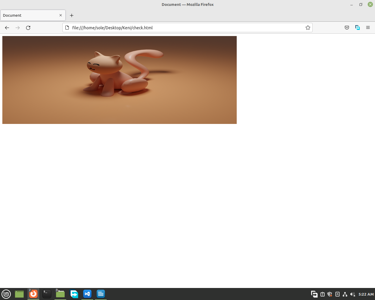
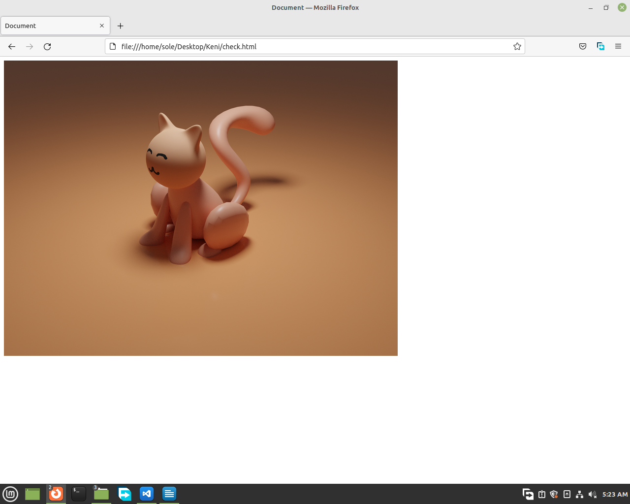
We will increase their size. And here, we recommend you to use only width or only height for images because if you set a specific width and height they will be stretched and that will look bad. What we will
instead do is just give them a width and make the computer adjust the perfect height for it.😉😉
For example when we use
width: 800px;
height: 300px;
this happens

but when we just use width,
width: 800px;
this happens

So now let's style our shapes
<style>
.shapes {
width: 100px;
}
</style>
And add animation names to each of our elements
<style>
.shapes {
width: 100px;
}
.circle {
animation-name: circle-animation;
}
.square {
animation-name: square-animation;
}
.triangle {
animation-name: traingle-animation;
}
</style>
And now we will tell how much seconds we want to the animation to take place. To do that we use animation-duration.
Like this
.circle {
animation-name: circle-animation;
animation-duration: 2s;
}
.square {
animation-name: square-animation;
animation-duration: 1s;
}
.triangle {
animation-name: traingle-animation;
animation-duration: 3s;
}
Then to start animating, we will call the our element by
@keyframes then writing the
animation-name.
Then in the curly brackets, we will write our animation.
For example:
If we want our circle to scale and move down, first
@keyframes circle-animation {
}
Then, we will write what the element must be at 0% of the animation time.
@keyframes circle-animation {
0% {
transform: scale(1) translate(0, 0);
}
}
Then, we will write what happens at 100%.
@keyframes circle-animation {
0% {
transform: scale(1) translate(0, 0);
}
100% {
transform: scale(1.7) translate(200px, 300px);
}
}
Now at 100% of the animation time, it will be scaled by 1.7, move to the left 200px and move down 300px.
And if you also want your animation to not stop go back to your class and add
.shapes {
width: 100px
animation-iteration-count: infinite;
}
Now the animations on your elements won't stop. If they end they will start-again.
The rest of the shapes you ask? Do your own animation for them.
Don't think it's hard. It will be easy for you after you use
it more.

