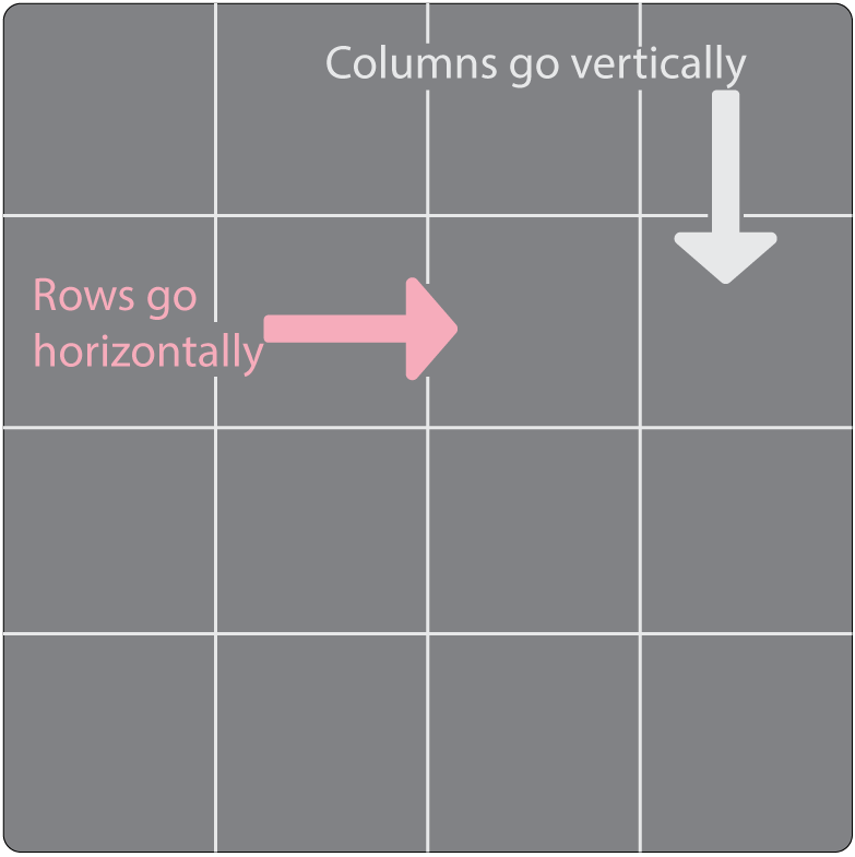
Flex and grid are really helpful, when you need to align many divs properly. We will learn about them now.
2.12.1. Flex
When we apply flex, we apply flex to the main container (The children Holder).
For example:
<html>
<head>
<style>
.container {
display: flex;
}
</style>
</head>
<body>
<div class="container">
<div class="child-1"></div>
<div
class="child-2"></div>
<div class="child-3"></div>
<div class="child-4"></div>
</div>
</body>
</html>
Then let's give our container a width of a full screen width. We do that by using 'vw', which is the short form of viewport width. And if we want a full height of the screen we will do that also by using 'vh', which
is the short form of viewport height. Here is an example for two of them.
.container {
width: 100vw;
height: 100vh;
display: flex;
}
But we don't need a full height let's just make it around 600px;
And now there is a problem. The problem is there is extra space and we can scroll horizontally (from left to right) and we don't want that so, we will remove
it.
To remove that we will learn the * selector. * selector selects every element that is on the file. It is called the Universal Selector. So, to remove every space from all the elements, we select all elements and remove their
space.😉
* {
margin: 0px;
padding: 0px;
box-sizing: border-box;
}
The fist property margin, is the space we want to have out of our container while padding is the space we want to have inside our container. Here's a detailed explanation for margin and padding.
Margin
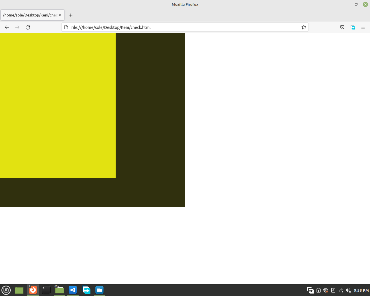
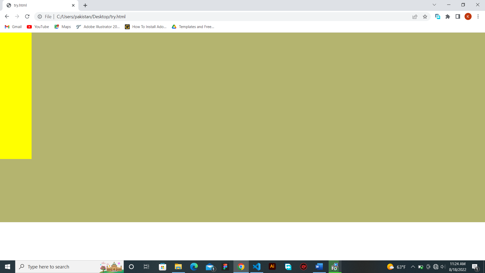
Here's an image of a webpage having no margin or padding. Note that we removed all the margin and padding by the Universal Selector(*).

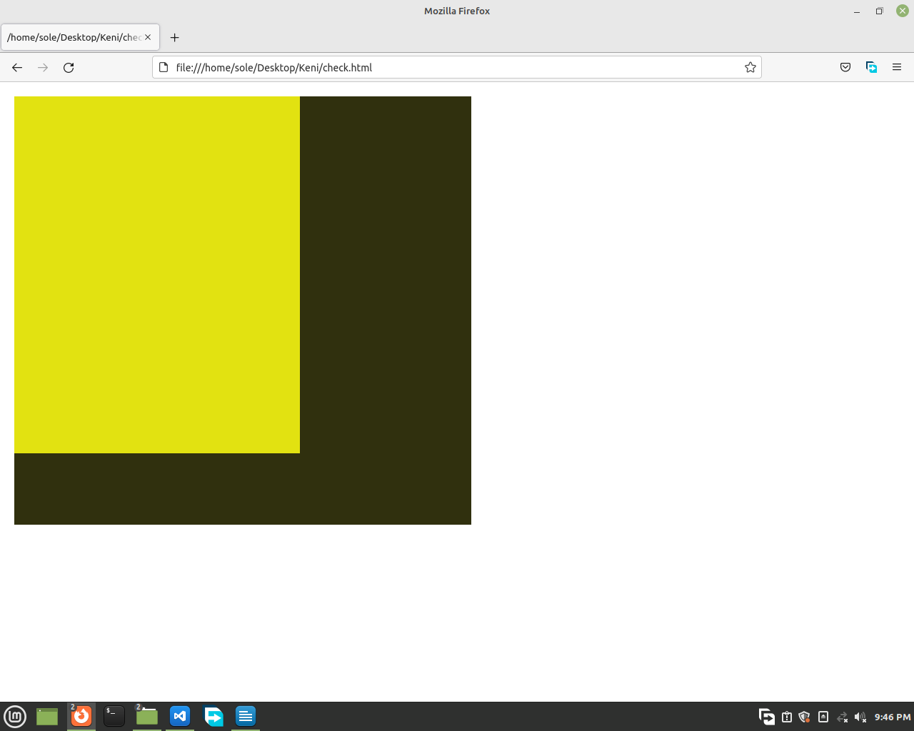
And when we add a margin of 20px to the black container this happens.

Look at that. The full code was
<html>
<head>
<style>
* {
margin: 0px;
padding:
0px;
box-sizing: border-box;
}
.container {
margin: 20px;
display:
flex;
width: 50vw;
height: 600px;
background-color: rgb(48, 48, 14);
}
.container div {
width: 100px;
height:
500px;
background-color: rgb(226, 226, 17);
}
</style>
</head>
<body>
<div class="container">
<div class="child-1"></div>
<div
class="child-2"></div>
<div class="child-3"></div>
<div class="child-4"></div>
</div>
</body>
</html>
If we only want margin on the top we will say margin-top and add some value. And on the left margin-left and it's the same for bottom and right too.
Padding
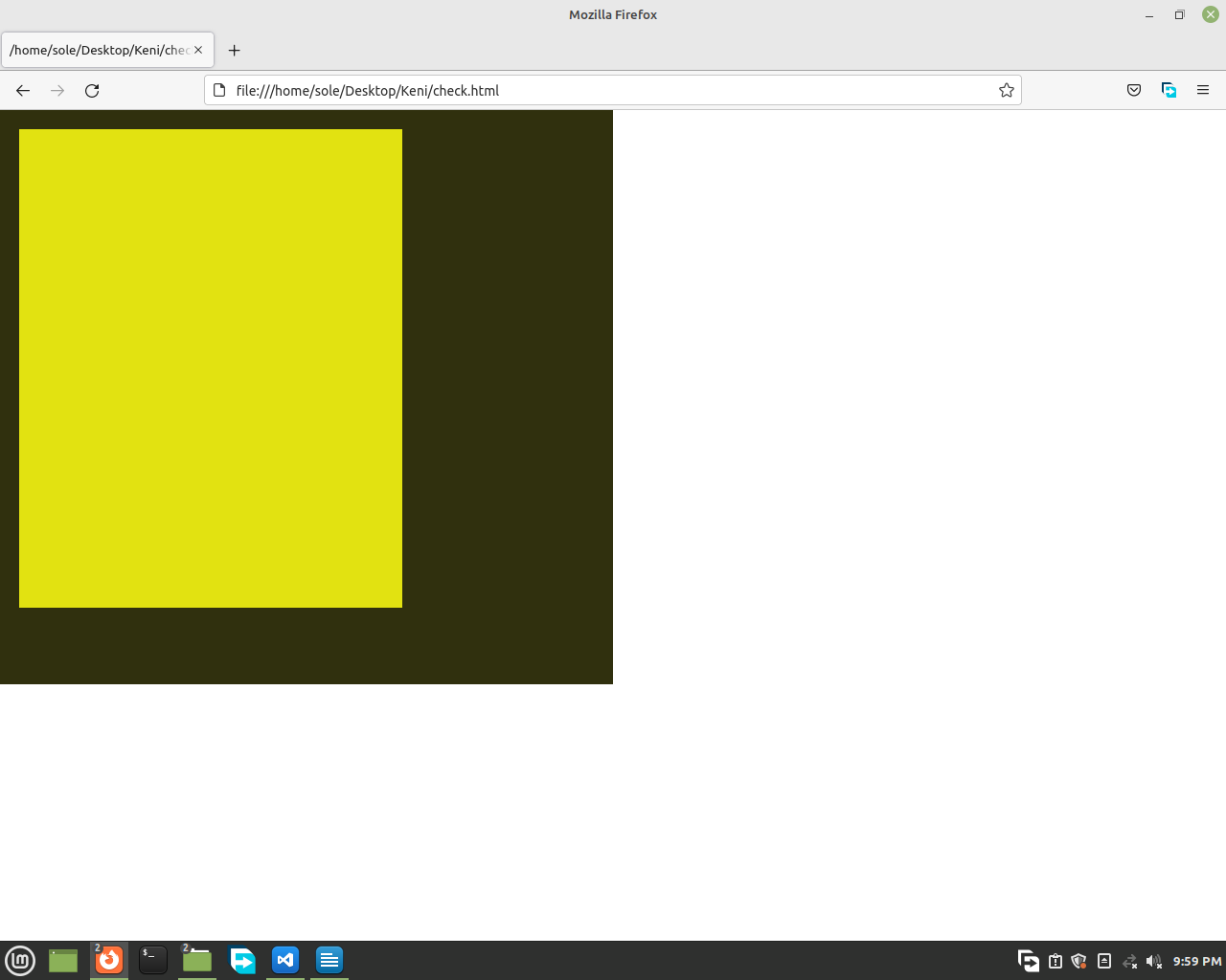
Now let's see padding. An image with no padding on the black container looks like these two images.


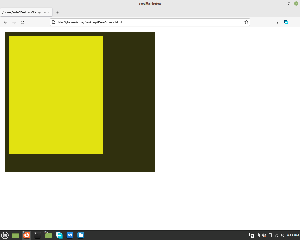
And when we add a padding of 20px, on the black container.


This is the difference between margin and padding.
Box-Sizing
And now the box sizing thing. That just has 2 main values, and they are content-box and border-box. Let's imagine we have a div with a width of 100% of its parent (container) and a border of 7px.
Like this code.
<html>
<head>
<style>
* {
margin: 0px;
padding:
0px;
}
.parent {
margin: 30px;
width:
20vw;
height: 200px;
background-color:
rgb(48, 48, 14);
}
.child {
width: 100%;
height:
100px;
background-color: tomato;
border:
7px solid orange;
}
</style>
</head>
<body>
<div class="parent">
<div class="child"></div>
</div>
</body>
</html>

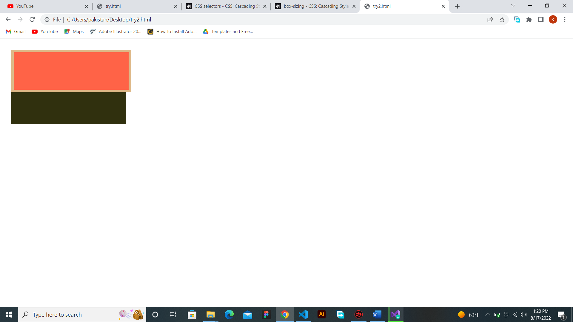
Normally, CSS sets the box-sizing to content box which makes the border out of our parent like the previous image.
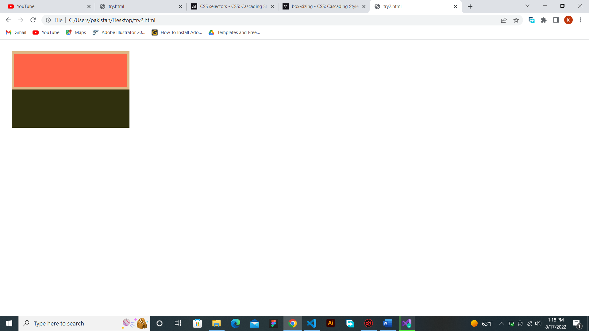
⭐ And if we don't want that space, we make the box-sizing to border-box,
and this happens.
<html>
<head>
<style>
* {
margin: 0px;
padding:
0px;
}
.parent {
margin: 30px;
width:
20vw;
height: 200px;
background-color:
rgb(48, 48, 14);
}
.child {
width: 100%;
height:
100px;
background-color: tomato;
border:
7px solid orange;
box-sizing: border-box;
}
</style>
</head>
<body>
<div class="parent">
<div class="child"></div>
</div>
</body>
</html>

Let's get back to our flex.
Then let's add a background-color to the parent div. Let's use an rgb color model. This color model helps you to use multiple colors, which is wonderful. Search for it for more.
.container {
width: 100vw;
height: 100vh;
display: flex;
background-color: rgb(180, 180, 111);
}
And now, let's add background-colors, width and height to our children divs.
⭐ We can select them two ways the easiest one would be
.container div {
}
This selects every div that is in our container and that's what we need.
⭐ Or we can do the long way.
.child-1, .child2, .child3, .child4 {
}
The first way is better the second one is long.
So, the children will have a width and a height of 100px and a background-color of pink.
.container div {
width: 100px;
height: 100px;
background-color: rgb(255, 255, 0);
}
Full Code:
<html>
<head>
<style>
* {
margin: 0px;
padding:
0px;
box-sizing: border-box;
}
.container {
display: flex;
width:
100vw;
height: 600px;
background-color:
rgb(180, 180, 111);
}
.container div {
width: 100px;
height:
100px;
background-color: rgb(255,255,0);
}
</style>
</head>
<body>
<div class="container">
<div class="child-1"></div>
<div
class="child-2"></div>
<div class="child-3"></div>
<div class="child-4"></div>
</div>
</body>
</html>
😆 Now, let's learn how flex helps us.
First, let's see how to align them horizontally or vertically with 'flex-direction'.
⭐ If we want to align them vertically (from top to bottom), we will use column.
⭐ If we want
to align them horizontally (from left to right), we will use row.
Tip: The default value of flex-direction is row.
So, if you want to change it, just do it column and see how the children will be aligned. Try both column and row and see their differences
The code is:
.container {
display: flex;
flex-direction: column;
width: 100vw;
height: 600px;
background-color:
rgb(180, 180, 111);
}
It would look like this,

Because all of the background-colors of the children is yellow, and because there is no gap, the children look like one tall box. To have a gap between your items we use gap. Like
this
.container {
display: flex;
flex-direction: column;
gap: 10px;
width: 100vw;
height: 600px;
background-color: rgb(180, 180, 111);
}
Or let's use margin.
Like this
.container {
display: flex;
flex-direction: column;
width: 100vw;
height: 600px;
background-color:
rgb(180, 180, 111);
}
.container div {
margin-top: 10px
width: 100px;
height: 100px;
background-color: rgb(255,255,0);
}
I guess gap is better let's use gap for now. And also let's use row for now.
Full code:
<html>
<head>
<style>
* {
margin: 0px;
padding:
0px;
box-sizing: border-box;
}
.container {
display: flex;
flex-direction:
row;
gap: 10px;
width: 100vw;
height: 600px;
background-color:
rgb(180, 180, 111);
}
.container div {
width: 100px;
height:
100px;
background-color: rgb(255,255,0);
}
</style>
</head>
<body>
<div class="container">
<div class="child-1"></div>
<div
class="child-2"></div>
<div class="child-3"></div>
<div class="child-4"></div>
</div>
</body>
</html>
Justify-content
Justify content has 6 main values that you use many times. And they are flex-start or start, flex-end or end, center, space-between, space-around and space-evenly.
Flex-start: this aligns all
items on the start.

Flex-end: this aligns all items on the end.

Center: this aligns all items on the center.

Space between: forms a space between the items and not at the first and at the end.

Space around: forms an equal space between the items, but a little space between the container and the first item as well as the container and the last item.

Space evenly: forms an equal space everywhere.

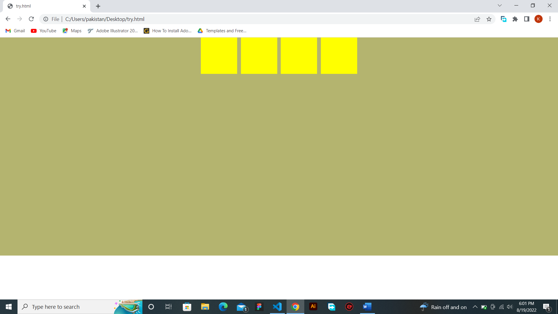
.container {
display: flex;
justify-content: center;
flex-direction: row;
width: 100vw;
gap:
10px;
height: 600px;
background-color: rgb(180, 180, 111);
}
Image:

Align Items
What if you want to align them the other way, you use align items.
Align items has 4 main values. They are flex-start or start, flex-end or end and center.
Full code:
<html>
<head>
<style>
.father {
display: flex;
flex-wrap:
wrap;
align-items: flex-start;
width:
400px;
height: 800px;
background-color:
skyblue;
}
.child {
width: 100px;
height:
100px;
background-color: grey;
margin:
10px;
}
</style>
</head>
<body>
<div class="father">
<div class="child"></div>
<div
class="child"></div>
<div class="child"></div>
<div class="child"></div>
<div class="child"></div>
<div class="child"></div>
<div class="child"></div>
<div class="child"></div>
</div>
</body>
</html>
There's a new thing you have seen. Is it flex-wrap? Yes, it is. And it helps us to make our children go to the next line if they is no space left for them. That's all that it does.
Flex-start

Center

Flex-end

2.12.2 Grid
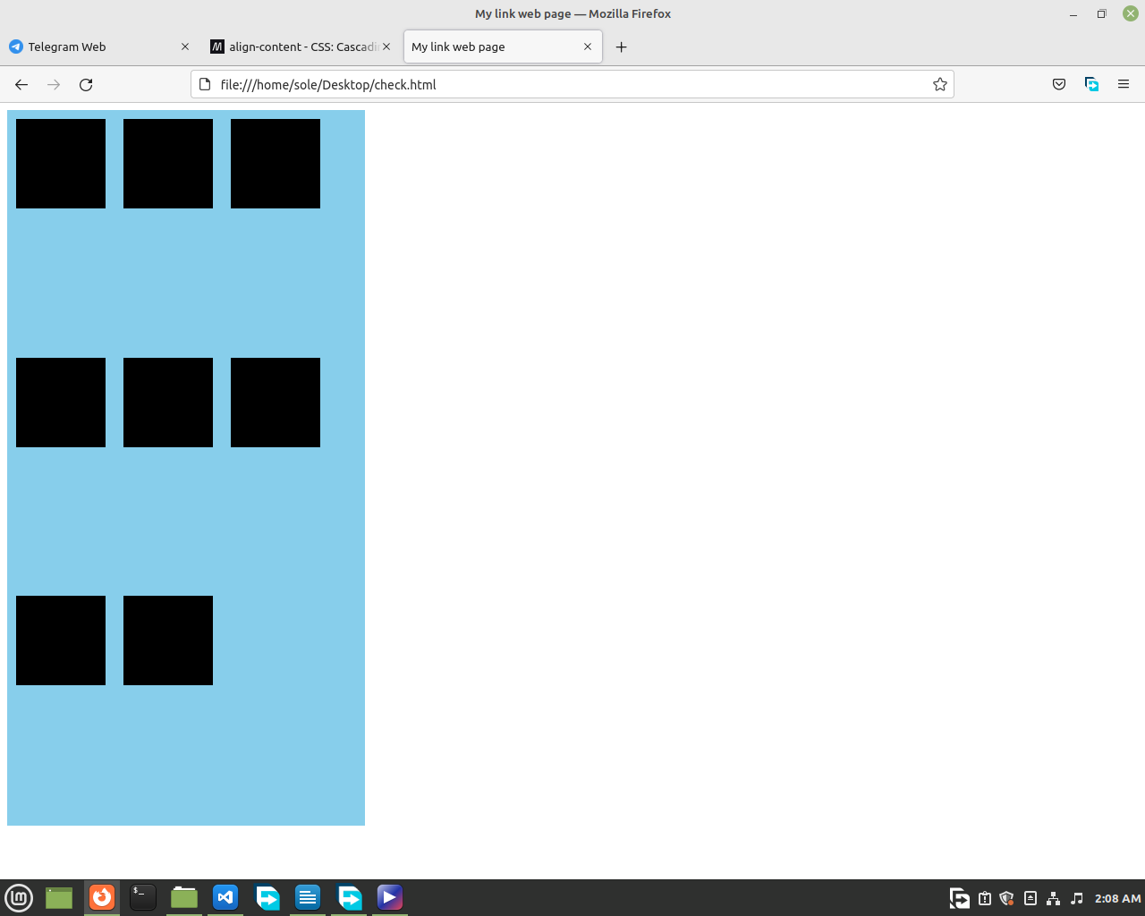
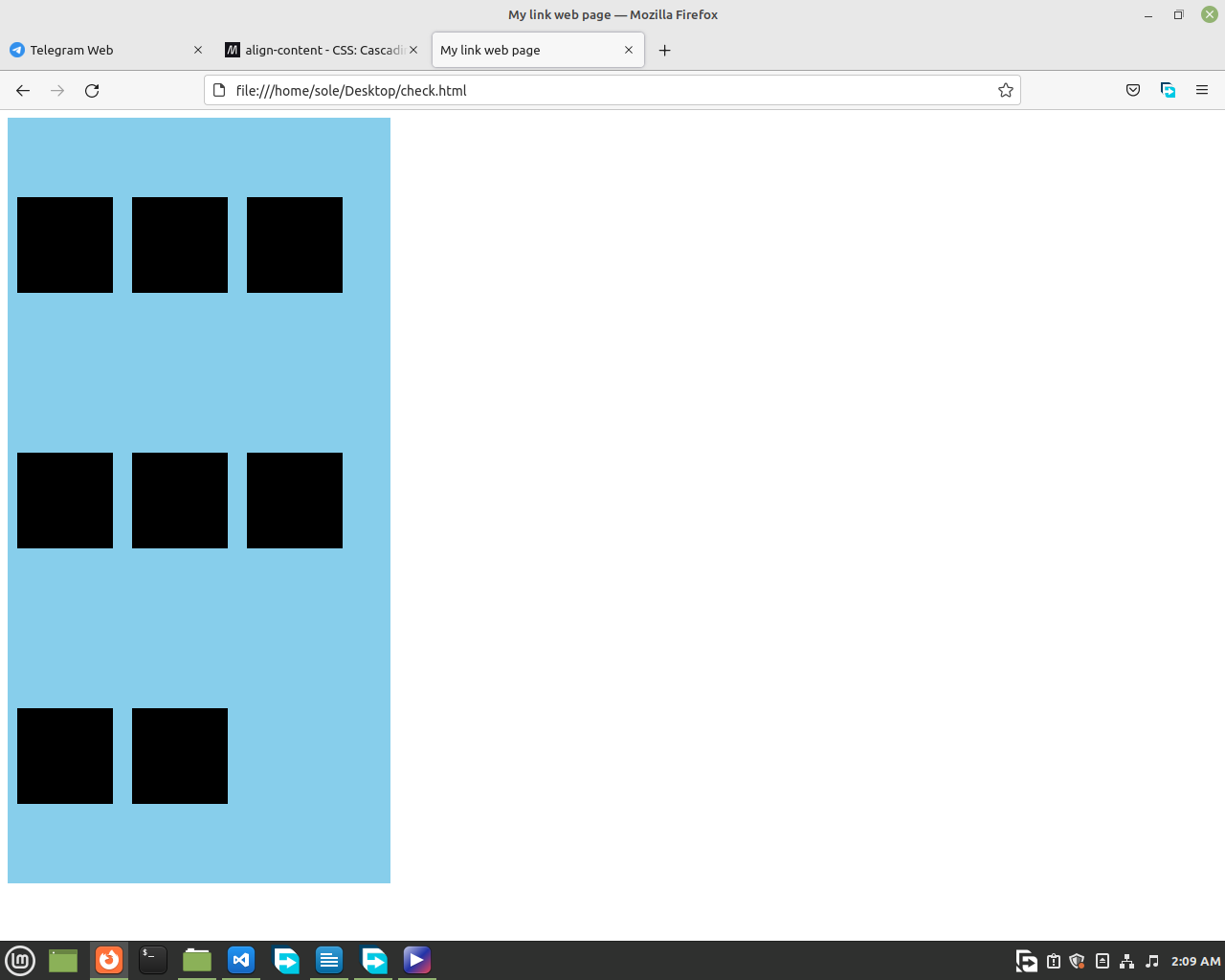
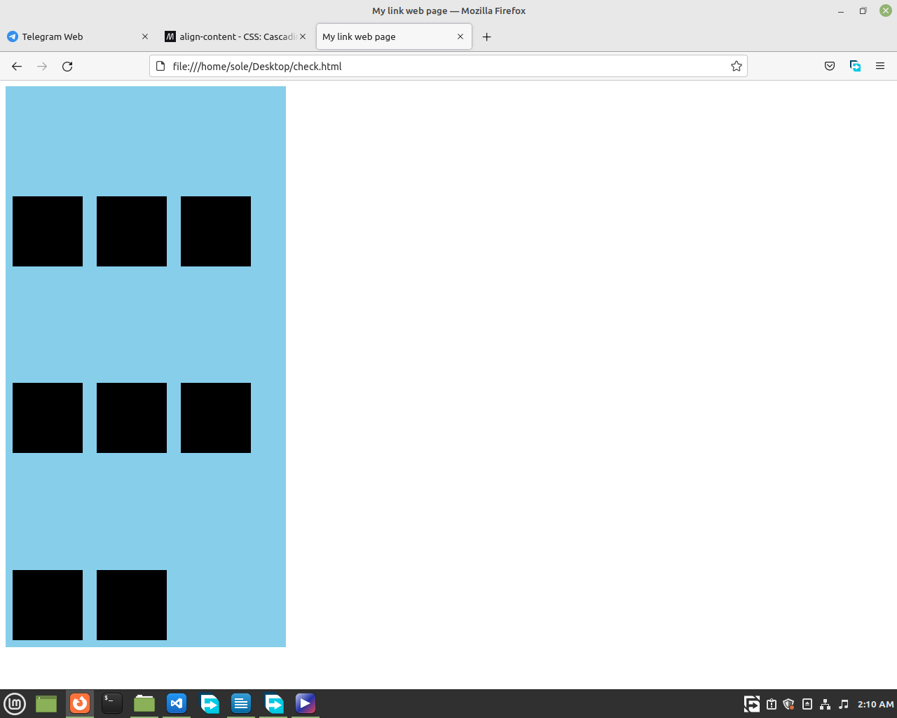
Grid helps to align our children more powerfully. Usually, flex is used to align children that end in one row, but grid is used if you have more than one rows.
🌟 You may ask yourself why won't we use flex
wrap? What's the problem? Well, you can use that, but grid is just good for such things. So, let's learn how to use it.
First, you are going to write display: grid; We will write this in the father's class.
Like this,
<html>
<head>
<style>
.father {
display: grid;
width:
400px;
height: 800px;
background-color:
skyblue;
}
.child {
width: 100px;
height:
100px;
background-color: grey;
margin:
10px;
}
</style>
</head>
<body>
<div class="father">
<div class="child"></div>
<div
class="child"></div>
<div class="child"></div>
<div class="child"></div>
<div class="child"></div>
<div class="child"></div>
<div class="child"></div>
<div class="child"></div>
</div>
</body>
</html>
then we will tell how much rows or columns we want.

Here, we use the property
'grid-template-columns' to define how much columns we want and we use
'grid-template-rows' to define how much rows we want.
There are many ways to define how much rows or columns you want.
One is to write the width of the rows or columns you want, as many times as you want.
For example:
.father {
display: grid;
grid-template-columns: 100px 100px 100px;
width: 400px;
height: 800px;
background-color:
skyblue;
}
Now, you will have 3, 100px space holding children, in each of your container's row.
Or if you don't want to write 100px 3 times you just use the repeat function.
.father {
display: grid;
grid-template-columns: repeat(3, 100px);
width: 400px;
height: 800px;
background-color:
skyblue;
}
And if you want to align them equally, you will use 1fr. It's called fractional unit.
.father {
display: grid;
grid-template-columns: repeat(3, 1fr);
width: 400px;
height: 800px;
background-color:
skyblue;
}
If you also want to add more space you can use grid-gaps.
.father {
display: grid;
grid-template-columns: repeat(3, 1fr);
grid-gap: 20px;
width: 400px;
height:
800px;
background-color: skyblue;
}
You actually won't use
grid-template-rows much, but if you are curious about it, it is just used as
grid template columns. Their values are the same. Which means that you can use
repeat() or the other way to define how much rows you want.
😉 Finally, We recommend you to use both grid and flex in your future projects. Use grid when you have to deal with multiple children in your container, and use flex for simple one row children.
This lesson was long long
one. You did a good job on keeping up.🤩🤩🤩🤩🤩 Take a rest and come back to learn.🙂

